Ubuntu 14.04 LTS wallpaper
Canonical
on 10 March 2014
Tags: Design
Hey
For the last couple of weeks we’ve been working on the new Ubuntu Wallpaper. It is never easy trust me. The most difficult part was to work out the connection between the old wallpapers and the new look and feel – Suru. The wallpaper has become an integral part of the ubuntu brand, the strong colours and gradated flow are powerful important elements. We realised this when looking from a distance at someone laptop it really does shout UBUNTU.
We spent some time looking at our brand guidelines as well as previous wallpaper thinking how to connect the old with the new and how to make the transition smooth. I did start with simple shapes and treated them as a separate sheets of paper. After a while we moved away from that idea simply because Suru is about simplicity and minimalism.
When we got the composition right we started to play with colours, we tried all our Ubuntu complimentary colours but we were not entirely happy. Don’t get me wrong 😉 they did look nice but it didn’t feel like a next step from our last wallpaper…
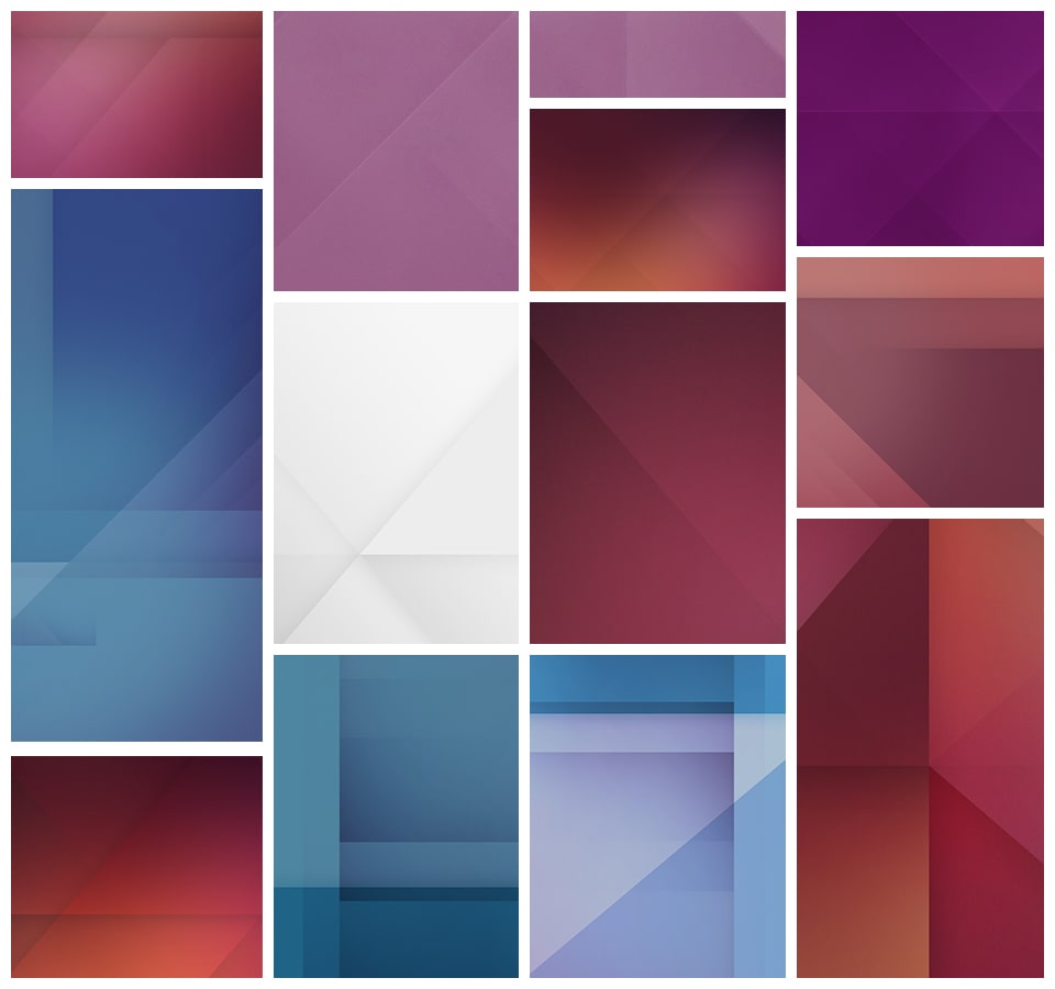
And here some examples of the things I was exploring…
Talk to us today
Interested in running Ubuntu in your organisation?
Newsletter signup
Related posts
Why Web Engineering is great
Like many software engineers, one of my first software development experiences started with creating my own web page. Since that time 20+ years ago, a lot has...
From inspiration to impact: design students from Regent’s University London explore open design for their dissertation projects
Last year, we had the opportunity to speak at Regent’s UX Conference (Regent’s University London’s conference to showcase UX work by staff, students, and...
Showcasing open design in action: Loughborough University design students explore open source projects
Last year, we collaborated with two design student teams from Loughborough University in the UK. These students were challenged to work on open source project...


